How color affects on branding ,website pages and paid ads
The psychology of color as it relates to persuasion is one of the most interesting — and most controversial — aspects of marketing.
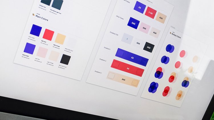
Color theory is a topic of complexity and nuance, but color psychology in marketing and branding is typically represented in splashy infographics that rarely go beyond See ‘n Say levels of coverage. These surface-level discussions leave us unequipped to make smart decisions about how to use the color spectrum to convey the right message with our marketing and branding. But why is such a potentially colorful conversation so unwaveringly shallow?
What is color psychology?
Color psychology is the study of how colors affect perceptions and behaviors. In marketing and branding, color psychology is focused on how colors impact consumers’ impressions of a brand and whether or not they persuade consumers to consider specific brands or make a purchase
It’s an important field of study to consider when creating marketing assets, building a new business, or rebranding an existing one. Consider this: In a study titled “Impact of color on marketing,” researchers found that up to 90% of snap judgments made about products can be based on color alone.
How to make practical decisions about color in your marketing and branding
The bottom line is that there are no clear-cut guidelines for choosing colors for your brand. While it would be nice to be able to simply look at an infographic and make the right decision, the reality is that the answer to “What colors are right for my brand?” is always “It depends.”
It’s a frustrating answer, but it’s the truth. The context you’re working within is an essential consideration. It’s the feeling, mood, and image that your brand or product creates that matters.
The good news: Research into the color psychology of color can help you make the right choice.
The right color is appropriate for your brand
In a 2006 study, researchers found that the relationship between brands and color hinges on the perceived appropriateness of the color being used for the particular brand. In other words: Does the color fit what’s being sold?
When it comes to picking the “right” color, research has found that predicting consumer reaction to color appropriateness is far more important than the individual color itself.
So when considering colors for your marketing and branding, ask yourself (or better yet, collect customer feedback): “Is this color appropriate for what I’m selling?”
The right color shows off your brand’s personality
Purchasing intent is greatly affected by colors due to their effect on how a brand is perceived; colors influence how customers view the “personality” of the brand in question.
And while certain colors do broadly align with specific traits (e.g., brown with ruggedness), nearly every academic study on colors and branding will tell you that it’s far more important for colors to support the personality you want to portray instead of trying to align with stereotypical color associations.
Psychologist and Stanford professor Jennifer Aaker has conducted studies on this very topic, and her paper titled “Dimensions of Brand Personality” points out five core dimensions that play a role in a brand’s personality.
The right color appeals to your audience
One of the more interesting examinations of color psychology in relation to gender is Joe Hallock’s work on “Colour Assignment.”
Hallock’s data showcases some clear preferences in certain colors across gender. It’s important to note, however, that most of his respondents were from Western societies. One’s environment — and especially cultural perception — plays a strong role in dictating color appropriateness for gender, which, in turn, can influence individual color preferences.
Additional research on color perception and color preferences shows that when it comes to shades, tints, and hues, men generally prefer bold colors while women prefer softer colors. Also, men were more likely to select shades of colors as their favorites (colors with black added), whereas women are more receptive to tints of colors (colors with white added).
Although this is a hotly debated issue in color theory, I’ve never understood why. Brands can easily work outside of gender stereotypes. In fact, I’d argue many have been rewarded for doing so because they break expectations.
“Perceived appropriateness” shouldn’t be so rigid as to assume a brand or product can’t succeed because the colors don’t match surveyed tastes, which leads me directly into the next point.
Finding your own palette
We’re at the end of this post and there’s still no cheat sheet for choosing the perfect color or color scheme in sight. In fact, we may have raised more questions than answers. What a ripoff.