How to write a professional letterhead
How to write professional letterhead? Letterheads should be designed in a way that helps the reader know exactly who sent the message.
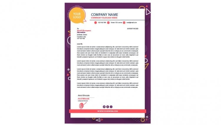
A letterhead is a pre-printed heading on documents like letters, memos, and notes. Including one will make any document look professional and help keep your branding consistent. Letterheads should be designed in a way that helps the reader know exactly who sent the message, and it won’t get lost in the clutter. Back in older days, your name, address, and contact details at the top-right of your client correspondence constituted a letterhead. Today, letterheads have become a visual art, delivering a first impression of who you are, what you do, and why you do it.
The keys to making a great letterhead are:-
- A well-designed logo. In the examples below, you'll notice how a strong logo makes each letterhead design compelling and unique.
- Solid brand framework. Your design should reflect who you are, not who your designer is. From colors to layout design, your brand personality should be evident in every element.
- Document consistency. Keep your marketing materials consistent. Your letterhead template should be tamper-proof to prevent logo stretching, rogue fonts, and clashing colors.

So, while designing letterhead following constraints should be kept in mind:-
1) GET THE BASICS RIGHT
First, make sure you’re using the best software for the job. Word or Pages are fine for an ultra-simple layout, but these will impose limitations when it comes to using graphics or an unusual text layout. A program that’s tailored to creating more flexible publishing layouts is a much better choice and will help you to develop your design more professionally as you go. Adobe InDesign is probably the most suitable program for creating letterhead layouts. If you’re determined to use Photoshop, remember to set up your canvas to 300 DPI to avoid any blurring or pixelation when you go to print. Secondly, you need to consider the sizing of your letterhead. There are standard sizes for letterheads according to region. If you want to fit your letter in a standard-sized envelope (which is advisable—these are more economical to print or buy), you’ll have to use one of these standard sizes. Finally, think about the grid of your layout.
2) KEEP IT SIMPLE
One of the most important principles behind an effective letterhead is to keep the design as simple as possible. Keep in mind that a letterhead is essentially a delivery mechanism. It’s important your letterhead looks and feels great in the hand, but the design should make way for the content of the letter that’s printed over it. By all means, use your design to showcase the content, but don’t try to wrestle it for the reader’s attention. It’s useful to ask yourself whether you’re competing with the content: if you’re in doubt, simplify your letterhead design.

3) ADAPT TO YOUR AUDIENCE
While you’re completely absorbed with perfecting your grid and creating cool graphics to use on your letterhead, you should take a moment to pause and consider who you’re actually sending the letter to. There’s nothing more inappropriate than sending a multicolored, hip letterhead to a formal, corporate company. Likewise, an ultra-minimal design might not communicate to that young start-up that you’re a fun team member to have around.
4) USE COLOR SPARINGLY
This rule applies to pretty much anything you design but is worth repeating regardless. Colour is a great way to draw attention to your design, and to specific areas within your letterhead. Not only can it highlight a section, but it can also communicate specific ideas and emotions, create associations and, of course, reinforce branding. Color is an extremely powerful tool that can make or break your letterhead design – but as the saying goes, with great power comes great responsibility. Use color sparingly and make the most of the impact it brings to your letterhead design.

5) INTEGRATE PHOTOS INTO YOUR DESIGN
A letterhead might not seem the obvious place to showcase your photography skills, but subtly integrating the photo into your design can look incredibly modern and effective. It goes without saying that if you’re applying for a photography role, it’s certainly not a bad idea to use a photo in the header of your layout. But any letterhead might benefit from an image. While a portrait shot might seem a bit intimidating or pretentious, a landscape shot or a patterned image can add an extra dimension of interest to your design.
6) NO COLOR PRINTER? NO PROBLEM!
OK, let’s think practically for a moment. It’s all very well designing a letterhead in an array of brilliant colors and finishes, but if you’re designing these for a working office you might find that in-office printers are going to diminish the quality of your designs. So, what’s the solution if the company you’re designing for only have practical access to non-color printing? There’s no need to shudder—you can easily create a letterhead design that will work equally well for color and non-color printing. Bright colors can appear dull and greyed out when printed on non-color printers, so aim for a strong monochrome design instead. You can visit on samples of letterhead for reference.

7) USE A WATERMARK
With border or corner designs on your letterhead, it sometimes feels like there still isn’t enough room for the text. If you have a tendency to write long letters, or would rather just not reduce further the amount of space available on the page, a watermark is a fantastic solution for adding color and graphics without sacrificing space. It’s also a great solution for the dodgy office printing situation where you might not even be able to print to the trim edge of the page. Position a watermark in the dead center of the page and there’s no chance of elements of your design being chopped off by the printer. Watermarks may be one of the oldest stationery tricks in the book but there’s an art to getting them right. Too dark and they can obscure text, too pale and they can lack impact.